css flex-grow 属性
2023-11-22 09:21PM
参考:https://www.runoob.com/cssref/css3-pr-flex-grow.html
在 css 中如果使用了 display: flex,你就需要使用 flee-grow 属性来控制指定弹性盒子中项目的放大比例。
flex-grow属性接受一个非负数值作为参数,表示项目的放大比例。默认值为0,表示项目不会放大。
如果所有项目的flex-grow值都为0,剩余空间将按照其原始尺寸进行分配。如果一个项目的flex-grow值为1,而其他项目的flex-grow值为0,那么前者将占据所有剩余空间。
基本语法:
flex-grow: <number>;
eg:
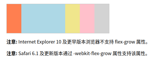
让第二个元素的宽度为其他元素的三倍
<!DOCTYPE html>
<html>
<head>
<style>
#main {
width: 350px;
height: 100px;
border: 1px solid #c3c3c3;
display: flex;
}
#main div:nth-of-type(1) {flex-grow: 1;}
#main div:nth-of-type(2) {flex-grow: 3;}
#main div:nth-of-type(3) {flex-grow: 1;}
#main div:nth-of-type(4) {flex-grow: 1;}
#main div:nth-of-type(5) {flex-grow: 1;}
</style>
</head>
<body>
<div id="main">
<div style="background-color:coral;"></div>
<div style="background-color:lightblue;"></div>
<div style="background-color:khaki;"></div>
<div style="background-color:pink;"></div>
<div style="background-color:lightgrey;"></div>
</div>
<p><b>注意:</b> Internet Explorer 10 及更早版本浏览器不支持 flex-grow 属性。</p>
<p><b>注意:</b> Safari 6.1 及更新版本通过 -webkit-flex-grow 属性支持该属性。</p>
</body>
</html>
运行结果如下:
登录
请登录后再发表评论。
评论列表:
目前还没有人发表评论